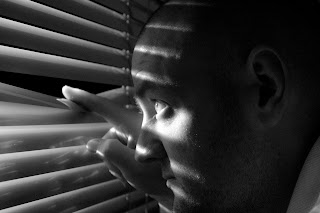
Edited as per tutor comments – adding a thin black outline around the image saves it from seeming lost and floating in blank space.
I decided not to remove the shadow from this image, however I have cleaned up the area to the left to make it look better, this is something that I missed on initial inspection.
Image 3 – edited
I decided to change image 3 – as the crop was wrong and it didn’t look right as a portrait image either. However the image that I have chosen was cropped to square as this fits the upper torso – Im not sure if this is right or wrong, but it looks acceptable to me.
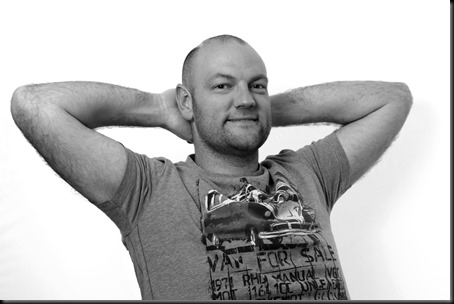
Image 4 – Original

My tutor advised that this was not a good crop as there was too much white space in the image (which I actually like), but I have taken the comments on board and I have re-cropped.
A tighter crop of image 4 to portrait instead of landscape


No comments:
Post a Comment
Note: only a member of this blog may post a comment.