Wednesday 24 October 2012

Other reading and interests

I love this idea - and will definately be considering it the next time I have a tight deadline to meet and the raining is upon us. I love the way the raindrops give that distorted feel to the image, making almost stir harder at it to see what it is your looking at.


screenshot of [online images] access at http://www.lagalerie.de/hatakeyama7.html on 24 October 2012

Friday 19 October 2012

DPP 3 - Exercise: Colours into Tones 2

DPP 3 - Exercise: Colours into Tones 2

The brief:

Make practical use of channel adjustments to achieve a specific effect
  • Landscape
  • Portrait
  • Garden scene


Original image of a young boy at a bonfire party, with a bright halogen light to the left and a bonfire lit to his right.  I liked the innocent look upon his face and they way he was looking directly at me, I think it has a certain atmospheric feel to it.  (This was taken at a friends bonfire party last weekend).  Taken at approximately 7pm it was after sunset with still a reasonable amount of light in the sky.


Desaturated image as per photoshop
 
 
Black and white conversion where the red and yellow sliders were adjusted to the left and the green and blues adjusted to the right.
 
I had a good play with the sliders in this image, back and forth and finally settled on this - they are only slight adjustments but by altering the blue slider to the right this has allowed for the brightening of the right side of the boys face.  Also, by sliding the red and yellow to the left this has brought back some of the blown out highlights on the hair and face area.  I also noticed whilst playing with the sliders the amount of grain that it could produce and as this was a mixed light image with high ISO, I didnt make too many adjustments.
 
Having played around some with other photos, I believe that it is easier to think about the image before you take it and whether it is going to be converted to black and white or left colour, than it is to look for a photo from library to convert as not all images are ideal for black and white conversion.
 
Deliberate image
 
Here is an image that I deliberately went out looking for, it was taken in low light and I didnt like the colours that were produced.  There were alot of reflections in the window of the shop from cars and lights etc.
 
 
Original low light image

 
After converting to black and white, cropping and a little twicking - a much more pleasing to the eye image from a Bridal shop frontage.
 

DPP 3 - Exercise: Colours into Tones 1

DPP 3 - Exercise: Colours into Tones 1

Brief:

  • Take or choose 1 image from your library which contains at least two strong contrasting colours.
  • Convert to black and white and using editing software lighten one of the colours and darken the other.
  • Then make another image and perform the task in reverse ie: darkening the first colour and lightening the second.
 
Original image: cabbage and red chilli
 
Screenshot of the black and white conversion
 
First things first, to convert the image to black and white - (I like the texture of the cabbage in black and white, I think it looks really good).


Black and white image with no other adjustments
 
 
screenshot of lightening the red chilli and darkening the green cabbage
 
 
Here after the adjustments have been made shows the chilli now a greyish/white colour and the green cabbage with extra umph as the texture is now very striking - although a little blown out in the far left - however, I did darken the greens quite considerably.


Screenshot of the reverse process darkened reds and lighter greens
 
 
Not so keen on this image of darkened reds and lighter greens - It shows blown out areas at the top of the image due to lightening the green areas, but again all in the nature of the exercise and this could probably have been prevented with less lightening.
 

Thursday 18 October 2012

DPP 3 - Exercise: Strength of Interpretation

DPP 3 - Exercise: Strength of Interpretation

Take or choose from library 2 images that you think would best suit the following results.
  • A strong increase in contrast that will include clipping (loss of detail) in at least the shadow areas.  A pronounced S curve is the standard method.
  • Low key or high key treatment in which the entire brightness range is shifted down or up the scale.  Curves or levels are equally useful in creating this effect.

    After sitting for some time going through various images in my library and trying black and white conversions on them, this was definately harder than I initally imagined. Not every scene is suited to black and white photography. Although times have changed so much considering in the early to mid 1900s black and white was all they had.

Here are the 2 images that I have choosen for this exercise:

Original image

 
London
 
An open top bus tour allowed for this photo of the great architechure that London has to offer, it was late evening just before sunset this image was taken, the clouds have a slight pink tinge to them and I think the composition works well.
 
 
Pronounced S curve
 
I think this image looks very false with the pronounced S curve and harsh shadows and bleached sky, I may have over exagerated the 'S' but that was the aim of the exercise so stretch your imagination.
 
 
Black and white
 
Black and white version works well, although it looks a little flat in areas
 
 
Black and white with pronounced S curve
 
I quite like this version of the black and white image as it looks more interesting the shapes stand out well against the skyline.


Original Image

 
Spinnaker Tower - Southsea (Taken from Spice Island)
 
 
Pronounced S curve
 
I really dont like this version with the pronounced S curve, it is too over produced for me and extremely false looking
 
 
Black and white
 
Black and white is ok here although still a little boring with no great detail in the sky area, perhaps a few thick clouds would have helped this image
 
 
Black and white with pronounced S curve
 
Not sure why but I really like this image.  I think it makes Spinnaker Tower stand out really clearly.


Black and white images can definately be processed more than colour and to more extent without the lose of the detail.
 
A vital exercise in the fact that it took several attempts to find suitable images that could be used and also that bright vibrant colours and not the best for black and white conversion, its all about tones and textures.


DPP 3 - Exercise: Black and White

DPP 3 - Exercise: Black and White


Choose a subject, lighting condition or picture situation that you think will look better in black and white than in regular colour.

 
This image was taken at Havre de Pas - its the only pier structure on the Island and it leads out to an outdoor swimming pool.
 
It was a fairly miserable day with lots of heavy cloud, I took this image with the intention on converting it purely as I thought this would look much better as a black and white image.  Some images are more suitable for black and white photography and I believe the structure of this pier walkway to be a good candidate.  I think also had I got the chance to return during the evening this would have made a great composition with the lights of the pier on.
 
So here goes the conversion.


A few simple adjustments were made to this image, first of all I converted it to black and white and then made a few more adjustments in curves and a slight crop to finish.
 
To me the image still feels like there is something missing so I returned to photoshop and added a layer some hard light and this is the effect now.


I like this version, the sky looks stormy and moody and the walk way leads you into the frame.  I am pleased with the results of this image and definately believe it to look better as a black and white image rather than colour.
 
A couple of other practices, a fast flowing river in Tollymore Forest Park, N.Ireland
 
Original Image
 
Black and White
 
Indoor studio image


Mother and child - I think the black and white version of this which has had a layer added and blending mode soft light - a much more striking image than the colour version.


Research:
 
Digital cameras brought a whole new meaning to photography, with sophisticated cameras, excellent megapixels and advanced onboard technology, yet today we still shoot black and white images.  It is common practice in the modern day world to shoot in colour and then convert to black and white at a later stage, even the digital dark room has become so much more advanced.  Not all shots work in black and white, and that is the great advantage of shooting in colour - this way you can play around and see what works best for the particular image, however it is best to shoot in Raw to capture the most data that you possibly can.  High colour images ie: images with lots of different colours (hues) dont lend well to conversion to black and white.
 
Black and white means different things to different people.  It can be moody, dramatic and atmospheric and a classic image that will never age.
 
Subjects that look excellent in mono include: the new smooth skin of a baby, the age old skin of an older person as the wrinkles create fantastic areas for light and shadow, landscapes can also look great, heavy blanket cloud can appear fab in black and white images giving it a moody feel.  Also fine art nude photographers shoot in black and white as it gives an elegant feel to the image.
 
 
Other Photographers work
 
 
Jonathan Olley a British Photographer, who intended to study fine art and then developed a keen interest in War.  Photo Esseys included: Berlin Wall and the Velvet Revolution in Czechoslovakia for the UK press.


I particularly like this image of an Northern Ireland street taken by Jonathan Olley 1998, many people will take different ideas away from this image, including fear, desolation and protection, it is moody and dramatic and shows what life was like back in the late 1990's in Northern Ireland with the heavily guarded Police Station.
 
Edward Weston was a 20th century American Photographer. He has been called "one of the most innovative and influential American photographer and "one of the masters of 20th century photography.  He mainly studied, Landscapes, still lifes and nude portraits.
 
 
Whilst leafing through "The Photograph" this image caught my eye, obviously black and white, but striking too the pose that the model has adopted - I like this image, its simple and discret!
 
David Bailey (British Photographer) was regarded as one of the best British Photographers there was.  He was prodominately a fashion photographer working for Vogue Magazine, he was self taught as he suffered from Dyslexia and Dyspraxia and left school at 15, he had various jobs and saved for his first camera, which he bought when he was approximately 20 years old he worked as a studio boy before get got his first photography job.


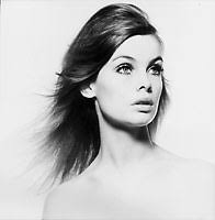
[online images] assessed on 18/10/2012 David Bailey
 
Tom Stoddart one of Britains most talented photojournalists was in his mid 40's when he self funded a trip to Sudan to cover the 1998 Famine.  He had already covered conflicts including Beirut, the Romanian Revolution, the fall of the Berlin Wall and the Iraq War.
 
In the history of photography there have been many times when images have helped to change the world by shocking people into taking direct action. One notable recent example is Tom Stoddart’s harrowing image of a starving child, photographed during the Sudanese famine of 1998.
 
[online images] accessed on 18/10/2101 initially viewed in Context and Narrative (Maria Short)


Another image that caught my eye a striking image of poverty and famine - a powerful image in itself for many reasons, a poor child shedding tears whilst being fed by an Aid Worker during the 1998 Famine.
 
Very powerful images that shocked the world!


DPP 3 - Exercise: Interpretative processing

DPP 3 - Exercise: Interpretative processing

  • Choose an image that you feel is open to different creative interpretations
  • 3 Variations of the same image is required
Original image


I have choosen this image of a Bride and Groom that I recently took, they look happy, young and carefree, despite the Groom's nervousness around cameras.

Black and white

 
A slight alteration to the curves and then I converted it to black and white.
 
Sepia technique


Here I adjusted the hue/saturation and changed the image to give it a sepia toned effect, I slightly altered the slides to give a more desired look,  I prefer this look to the black and white image, as it has more warmth about it.
 
Old school vintage style technique
 
 
Original image as taken
 
 
screenshot with adjusted curves and a new fill layer with solid colour in royal blue added, blending mode changed to exclusion (070142)
 
 
screenshot with new fill layer and solid pink tone used this time blending mode changed to soft light and lowered opacity to about 75% (de9b82)


screenshot with new fill later and solid pink tone used (a different colour than before), blending mode changed to soft light and opacity lowered to about 50% (fed1eb)
 
 
screenshot of a final fill layer with a dark royal blue tone used, blending mode changed to exclusion, before duplicating the original image, dragging it to the top of the layers panel and changing the blending mode to soft light. (070044)
 
 
The final variation - Vintage Image
 
This vintage image is great I really love the variation in contrast between the original image taken and this vintage image process in photoshop, it gives a very dreamy feel to it.
 
I couldnt have done it alone - the process was the help of a youtube video: http://www.youtube.com/watch?v=SwN44gu4YVk


PROUD!!!!

Ask me how proud I am ???  Id say wow very proud and excited!

This post has nothing at all to do with my OCA College work but I felt I had to share it as:-

The New video "Stronger Together" was shown today on National Television the lovely ladies from the Military Wives Choir were recently recorded and filmed in London and one of those lovely ladies can be seen holding an image taken by me thanks to Helen for showing this image on National TV x

This is only a screen shot and the quality is not fantastic - but I had to share it anyway!

Wednesday 17 October 2012

DPP 3 - Exercise: Managing Colour

DPP 3 - Exercise: Managing Colour

  • Find and use 2 or 3 images that have a sigficant colour cast.
  • Make sure one image contains a surface that is known to be grey ie: concrete, steel, aluminium, car tyres, asphalt, thick clouds and shadows on white
 
I have made screenshots of each image that I am going to use, 2 images are taken from Assignment 2 - Seeing like your camera (as my tutor suggested that they had slight colour casts to them - having reshot the images - I know see that he was right ;-)


I took this image of my son having fun on his scooter, I deliberately choose the wrong white balance setting so that it would show a blue colour cast.
 
 
Other features of this image is the concrete ground that he is scooting on
 
 
Using the concrete and the WB tool in raw - I corrected the colour, made a slight contrast adjustment and also cropped the image so that my son was off centre.
 
The following 2 images are those taken from DPP Assignment 2 Seeing like your camera (that were in need of colour cast removal)!
 

Screenshot of shoes and makeup - Every girls must haves!
 
 
I found this image a little trickier to adjust - but I think I have managed it!  The original image definately had a magenta cast to it and I believe that I have removed that by making the following adjustments: I changed the white balance setting in raw, I also slightly adjusted the levels and hue/saturation.
 
The next image is also from DPP Seeing like your camera - Wedding headgear.


Again the original image had a slight magenta colour cast to it - here in the 2nd image I have tried my best to remove it, by changing the WB setting in raw and then slightly adjusting the brightness.